This was the final poster for Harold Lloyd, I like the shocked look I managed to capture in his face,
the drawing was outlined with fineliners, scanned, and shaded in with the WACOM graphics tablet.
I really appreciate the different types of textures that I can achieve with the tablet.
Tuesday, 27 March 2012
Buster Keaton Finals, and Hardy
This image was the final image I used for my Manhattan Mono posters, for Buster Keaton, I felt his face really resembled the sad/bluesy look that he has. However if I dont feel it works so well with the background, due to this, i will reattempt this project.
Final poster version 1, i dont like the text, or the smoke so much either.
Final Poster version 2, the cleaner text works better.
An ink drawing of Oliver Hardy which I am really pleased with, I feel his expression is perfect in capturing his smile, and I also like the imperfections that are achieved through the use of inks.
Manhattan Mono, more trials
I like the Rock and Roll vibe this gives off, but probably not best for this style of movie poster project.
More Graphics Pad Trials
This is my trials for Buster Keaton.
Once again, with the use of the WACOM graphics pad, i experimented some more, seeing the different atmospheres and feelings, with the change in line thickness and positive and negative space.
Charlie Chaplin Tramp style.
Peeking over manhattan
Big head Keaton.
Once again, with the use of the WACOM graphics pad, i experimented some more, seeing the different atmospheres and feelings, with the change in line thickness and positive and negative space.
Charlie Chaplin Tramp style.
Peeking over manhattan
Big head Keaton.
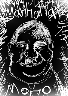
Manhattan Mono: Graphics Pad Oliver Hardy trials
These next four images are all trials which I have executed on the graphics pad, as I am a beginner with this new medium, my images may look rough, however I feel for a few, the persona of Oliver Hardy is well captured.
I feel this looked like a image from a post stamp or a coin graphic.
A bit too much like a farmer, need to decrease the size of his hat.
I like his gazed/silly look he has in this image, I feel his size is captured well with the linework.
I feel this looked like a image from a post stamp or a coin graphic.
A bit too much like a farmer, need to decrease the size of his hat.
I like his gazed/silly look he has in this image, I feel his size is captured well with the linework.
More Buddhas, and Shrine texture
This is just a photoshop trial, I scanned a pencil drawing and filled it in with photoshop CS3.
I used Adobe illustrator for this trial, using line trace, which as you can see, gives a very "Illustrator" look to the image. However i like the boldness and choice of color. The smiling faces, are Buddhist elements taken from a pattern of a famous buddhist illustration.
This Face in the center, is a representation of the Lord of Death " Yama" in the Buddhist religion. I like how the background (which was influenced by typical Buddhist patterns in ancient illustrations ) contrasts so well with the color of the face, really making it stand out. It even has a feeling of the chinese culture with the long upper lip / mustache. This icon was used in my final piece, but instead I composed the face by hand and also the textures by hand.
Wednesday, 21 March 2012
Experimentations for Buddha in the Shrine
This was an experimentation to create the Buddhas body, i used a metal mesh material for the shape, and covered it with paper mache, create a paintable layer. The shiny texture is due to the a layer of latex that I added to see the effect it would give. I felt that this result was unsuccessful, and scrappy looking.
These heads were made from a moulding clay, which simply needs to be left out in the air in order to harden. I really like the expressions I managed to capture on both the different trials.
This was my first attempt at creating a buddhas face, trying to capture the "fatness" and humbleness, and all the qualities of a buddha. I really liked this process, it was enjoyable.
Subscribe to:
Posts (Atom)


